Dickinson's Late Hand
April 16, 1862: I took [Emily Dickinson's letter of the previous day] from the post office in Worcester, Mass., where I was then living. It was postmarked "Amherst," and it was in a handwriting so peculiar that it seemed as if the writer might have taken her first lessons by studying the famous fossil bird-tracks in the museum of that college town. —Thomas Wentworth Higginson
In the first attempts at writing, the muscles may not properly perform what the mind directs, but by frequent and careful practice they are rendered supple and obedient in the execution of every variety of form. —from the Theory of Spenserian Penmanship, 1874

Focus 1: "Position of the Hand and Pen," in B. F. Foster, Practical Penmanship, Being a Development of the Carstairian System (Albany: O. Steele, 1832), pl. 3. Courtesy of Dartmouth Library.
In the single daguerreotype of Dickinson, probably taken at Mount Holyoke Academy when she was just seventeen, the aptitude of her long and tapered hands—there paralyzed around a stock bunch of dried flowers given to sitters who appeared nervous—remains hidden. Instead, their true progress is inscribed on the pages of her manuscripts, on which Dickinson makes manifest the traces of the writing process as well as the intimate relationship in her artistic process between conception and execution—or, more simply, the significance of touch to writing . . .
Several narratives—biographical, artistic, cultural—have emerged to account for the evolution of Dickinson's handwriting styles. Some early scholars suggested that changes in Dickinson's handwriting may have corresponded to changes in her vision; others speculated that significant changes in her handwriting paralleled shifts in Dickinson's psychic equilibrium. More recent scholars have focused on the ways in which Dickinson's handwriting inscribes her resistance to the economy of mechanical reproduction—especially the printing process but also the practice of copying that has as its goal the erasure of the traces of the writing process. ✝ For general guides to Emily Dickinson's handwriting, see especially Theodora Ward, "Characteristics of the Handwriting," in The Poems of Emily Dickinson, 3 vols., edited by Thomas H. Johnson (Cambridge, Mass.: The Belknap P of Harvard UP, 1955). For medical explanations of changes in Dickinson's vision that may have affected her handwriting, see, for example, Richard B. Sewall, The Life of Emily Dickinson, 2 vols. (New York: Farrar, Straus and Giroux, 1974); Richard B. Sewall and Martin Wand, "'Eyes be Blind, Heart be Still': A New Perspective on Emily Dickinson's Eye Problem," New England Quarterly 52 (September 1979): 400–406; Jerry Ferris Reynolds, "'Banished from Native Eyes': The Reason for Emily Dickinson's Seclusion Reconsidered," Markham Review 8 (1979): 41–48; Polly Longsworth and Norbert Hirschhorn, "'Medicine Posthumous': A New Look at Emily Dickinson's Medical Conditions," New England Quarterly 69, no. 2 (1996): 299–316; and James R. Guthrie, Emily Dickinson's Vision: Illness and Identity in Her Poetry (Gainesville: UP of Florida, 1998). For psychological explanations of changes in Dickinson's vision that may have affected her handwriting, see, for example, Theodora Ward, "The Finest Secret: Emotional Currents in the Life of Emily Dickinson after 1865," Harvard Library Bulletin 14 (Winter 1960); John Cody, After Great Pain: The Inner Life of Emily Dickinson (Cambridge, Mass.: The Belknap P of Harvard UP, 1971); Maryanne M. Garbowsky, The House without the Door (Mississauga: Associated UP, 1989). For analyses of Dickinson's relationship to the print medium, see Susan Howe, "These Flames and Generosities of the Heart: Emily Dickinson and the Illogic of Sumptuary Values," Sulfur 28 (Spring 1991): 134–53; reprinted in The Birth-mark: unsettling the wilderness in American literary history (Hanover: UP of New England, 1993), 131–53; Martha Nell Smith, Rowing in Eden: Rereading Emily Dickinson (Austin: U of Texas P, 1992); and Jerome J. McGann, "Emily Dickinson's Visible Language," Emily Dickinson Journal 2, no. 2 (1993): 40–57; reprinted in Black Riders: The Visible Language of Modernism (Princeton: Princeton UP, 1993), 26–41. For an excellent cultural history of handwriting in America, see Tamara Plakins Thornton, Handwriting in America: A Cultural History (New Haven: Yale UP, 1996). Indeed, like printing, which may be defined by its "negative relation to the hand" ✝ Michael Warner, The Letters of the Republic: Publication and the Public Sphere in Eighteenth-Century America (Cambridge, Mass.: Harvard UP, 1990), 7–9. and, by extension, to the "body and the corporeal individual who created it," ✝ Tamara Plakins Thornton, Handwriting in America: A Cultural History (New Haven: Yale UP, 1996), 29. Victorian penmanship codes concealed the self handwriting purportedly revealed by rigorously controlling the gestures of the scriptor: while the printing press regularized (and erased) the writing process mechanically by means of fixed "bodies of type, secured in chases, for printing at one impression" (OED), the more primitive talantograph regularized (and erased) the writing process manually by means of a ligature that literally bound the hand into the proper writing position for producing perfect copies. Unwilling to make herself over in the mirror image of the printing press, or to deny the "organic relationship between [herself] and [her] literary work," Dickinson insisted on the sensual scripting of the writing self reaching toward the antipodes of autonomism. ✝ Gillian Brown, Domestic Individualism: Imagining Self in Nineteenth-Century America (Berkeley: U of California P, 1990), 150.
In Dickinson's late work two broad scriptural styles, two "hands," one for rough-copy drafts, another for fair-copy drafts, reflect and translate two different phases of the compositional process. The handwriting style for rough-copy drafts, which remained constant even throughout the late years, is also the style of the dictation—a way of writing in speaking: the hand jolts into action. "But ought not the | Amanuensis also to | receive a Commission also -" (A 844), Dickinson asked in the final decade of her life. Executed quickly—it is possible to imagine involuntarily—these drafts or inscriptions reveal the unmediated quickenings of thought before their coalescence into a "work." Here composition is a state of emergency or rapt attention. The cometary pace of thought determines Dickinson's choice of materials—whatever lies close by—and is registered in a pulsational writing that often almost bypasses recognizable alphabetic symbols: the script is sometimes small and angular, sometimes large and loose, text is often superimposed over text, fault lines interrupt the narrative, and along the margins words and solitary letters appear sideways and upside down. Drafting within the very physical drive of writing, Dickinson reminds us of the impossibility of discerning final or original intentions; instead, her gestural messages keep us focused on trajectivity—on the path drawn by the hand in the present tense of writing. ✝ For a fascinating discussion of "trajectivity," see Paul Virilio, "The Perspective of Real Time," in Open Sky, 22–34.
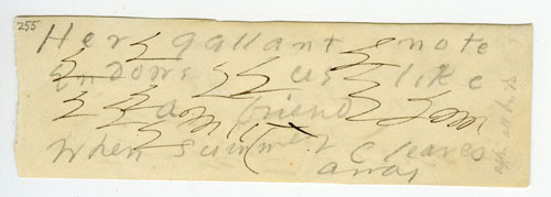
Focus 2: A 255. About 1877? Lines penciled amid pen tests on a scrap (30 x 94 mm) of wove, white stationery.
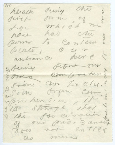
Focus 3: A 850. Last decade. Lines penciled on a fragment (111 x 90 mm) of wove, white stationery.
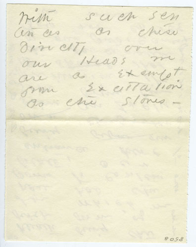
Focus 3a: A 850a.
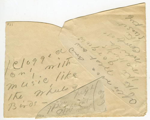
Focus 4: A 821. About 1885? Lines penciled on two scraps of envelope (102 x 127 mm; 31 x 64 mm) held together with a straight pin.
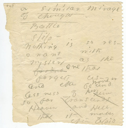
Focus 5: A 867. Last decade. Lines penciled on both sides of a torn and crumpled HENRY ADAMS PHARMACY wrapper (110 x 116 mm).
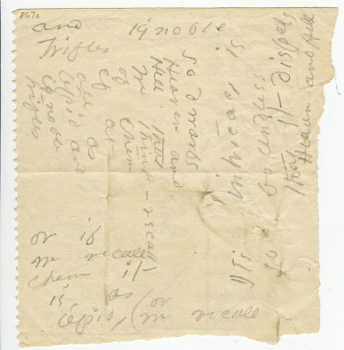
Focus 5a: A 867a.

Focus 6: A 809. About 1885? Lines penciled on a fragment (217 x 100 mm) of a book dust jacket (?).
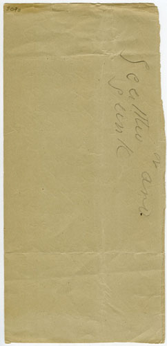
Focus 6a: A 809a.
The autocracy of forms may thus find its end in a poetics of immediacy, in an extempore "notation on extreme states of emotion, jotted in the margins of the moment." ✝ Kathleen Fraser, "Overheard," Poetics Journal 4 (May 1984): 99. Yet in the passage from rough-copy drafts to fair-copy drafts, as in the passage from one realm to another, the poetics of immediacy itself undergoes a change, escapes into what Kierkegaard called the "immediacy after reflection." ✝ Søren Kierkegaard, Repetition, translated by Howard and Edna Hong (Princeton: Princeton UP, 1983), 350 n. Dickinson's escape into the latter style, or hand, is at once signaled and accomplished through a practice—or, rather, a poetics—of copying in which calligraphy itself becomes expressive or aesthetic as it transcends the need to render the "fixed and unvarying forms of letters" and responds unconsciously to the chance ordering of words across the empty page. ✝ Roger Fry, Cézanne: A Study of His Development (Chicago: U of Chicago P, 1989), xxiv.
The hand Dickinson used in her fair-copy drafts changed dramatically over the course of her life. The traditional division of Dickinson's fair-copy drafts into three periods, though ultimately arbitrary, has assisted scholars in hypothesizing a working chronology for her largely undated writings; this periodization schema has in turn led to a clearer delineation of the boundaries of her style periods. In the manuscripts of the 1850s Dickinson's handwriting is small and flowing, upper- and lowercase letters are readily distinguishable, and most letters within words are linked. The characteristics and legibility of the early script suggest that Dickinson was modeling her hand after the exemplary hands of penmanship copybooks or, perhaps, the uniformity, though not the character, of print. In the 1860s, a period of profound poetic experimentation, Dickinson's calligraphy ceases to be simply recursive: the fixed alphabetic forms characteristic of the fair-copy hand of the 1850s are abandoned, the alignment of words on the page is irregular, and the extreme slant of the pen strokes gives the impression of a writer working under great strain. Finally, in the 1870s the handwriting of the fair-copy drafts evolves again. Dickinson's writing reaches its maximum size in the mid-1870s, and the unlinking of letters, begun in the early 1860s, is at this moment nearly complete, giving the manuscripts a new feeling of spaciousness. The strokes of the pencil—by 1879 Dickinson abandoned her pen for a pencil, perhaps also abandoning the permanent memory traces of ink for the more transient marks of lead—are centrifugal. The aim of copying no longer appears to be greater legibility but, rather, heightened visibility. Far from approximating the orderly pages of print, the fair-copy drafts resemble sketches in which Dickinson continually reopened the field of verbal-visual exchange in order to explore the relations among inscription, accident, and revisioning. In her late, fair-copy holographs, dashes often appear waved or wandlike, the ascenders and descenders of her "d"s and "y"s stream away from the letters, the crossbars of her "T"s detach from their stems and arrow out to the left or the right, and Dickinson's "O"s and "W"s appear as ciphers of an enigmatically open code. On the "spectrum from pure picture to pure letter," this writing is "at both ends at once." ✝ J. Hillis Miller, Illustration (London: Reaktion Books, 1992), 77. The passage reads: "He [Ruskin] understands that there is an element of writing in every picture. In an illuminated capital the one flows into the other. They are superimposed or interwoven. The place where one stops and the other begins can scarcely be detected. Where would one put an illuminated capital on my spectrum from pure picture to pure letter? It seems to be at both ends at once, therefore the locus of a battle between extremes." Reading, once a strictly linear process, a reading within the rule, now requires the cultivation of an equally floating attention.
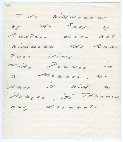
Focus 7: A 750. About 1883? Lines penciled on a partial leaf (153 x 132 mm) of laid, off-white stationery embossed Pure Irish Linen F. H. D. & Co. and impressed with a crown.
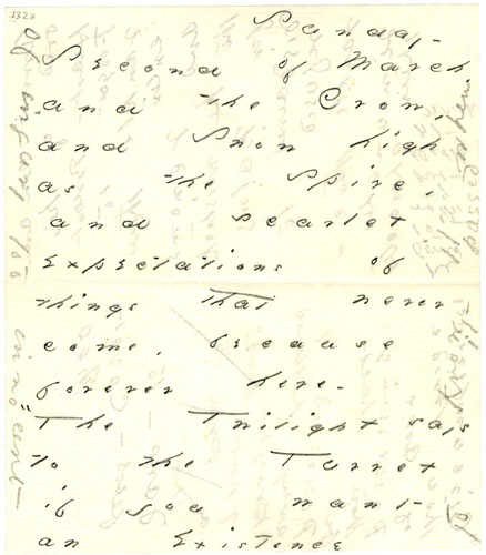
Focus 8: A 132a. Last decade. Lines penciled on a partial leaf (152 x 132 mm) of laid, off-white stationery embossed Pure Irish Linen F.H.D. & Co.
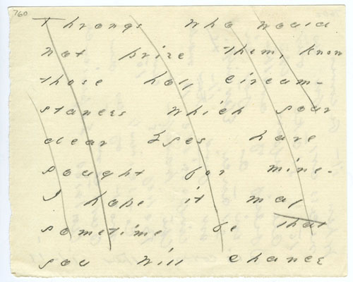
Focus 9: A 760. Last decade. Lines penciled on a partial leaf (100 x 126 mm) of laid, off-white stationery embossed ORIENT (?).